

Overview
MakeCents is an AI-powered personal finance app designed to help users understand where their money is going and what they can do about it. Rather than simply displaying financial data, MakeCents proactively surfaces personalized insights around spending habits, recurring expenses, and potential savings.
Our goal was to explore how AI could make financial information more actionable—surfacing relevant guidance at the right moment without requiring users to constantly analyze their own spending.
Role
Product Designer
Timeline
3 Weeks
Team
5 people
My Contributions
UX Research · Product Design · Prototyping
The Problem
Subscription services make recurring spending easy to overlook. While budgeting apps give users access to their financial data, they often leave users responsible for identifying spending patterns and deciding when action is necessary.
The challenge wasn't a lack of information—it was turning that information into timely, actionable guidance.
Research & Key Findings
To understand how existing products approached recurring expenses, we reviewed relevant research and evaluated popular budgeting tools. We found that most products were effective at displaying financial information, but still placed the burden on users to interpret that data and decide what to do next.
Insight 01
Tracking isn't enough
Budgeting tools organize financial information, but users still have to interpret that data themselves. We saw an opportunity to move beyond tracking by helping users understand what deserves their attention.
Insight 02
Timing Drives Action
Financial guidance is most useful when it appears at the moment a decision can be made. Insights need to surface when users can actually act on them.
Insight 03
AI Should Feel Effortless
AI should reduce complexity rather than introduce another interaction to manage. Instead of requiring a dedicated chatbot, we embedded guidance directly into relevant moments throughout the experience.
How might we design an AI-assisted financial awareness tool that increases subscription visibility without overwhelming users?
How Might We
Smart recommendations should feel like a natural part of the experience, not another feature users have to discover.
Design Principle
User Flows
Before moving into interface design, we mapped the core journeys from onboarding and account connection to understanding spending and acting on personalized recommendations. This helped us identify where guidance should appear and where users needed to remain in control.

←
→
These flows helped us define how users move from financial information to action while keeping AI recommendations contextual rather than intrusive.
Design Decisions
Research revealed that users didn’t need more financial data—they needed help knowing when to act on it. Three decisions shaped how we turned those insights into the final MakeCents experience.
Decision 01
Bring recommendations to the user
Early concepts explored a dedicated AI chatbot where users could ask questions about their spending. However, this still required users to actively seek out financial guidance. Instead, we embedded AI insights directly into the home experience, surfacing relevant recommendations at the moment they could be useful.

Decision 02
Eliminate manual subscription tracking
Manually tracking subscriptions added unnecessary effort for users already trying to manage their finances. We designed an onboarding flow using Plaid to securely connect users’ bank accounts and automatically identify recurring subscriptions. By removing manual entry, users could begin receiving personalized insights with minimal setup.

Decision 03
Highlight subscriptions that matter most
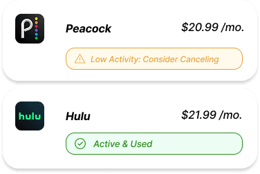
Not every subscription requires the same level of attention. Rather than prioritizing subscriptions by cost alone, we used signals like usage activity, renewal timing, and potential savings to surface the ones most worth reviewing. This helps users quickly identify opportunities to save while allowing actively used subscriptions to stay in the background.
Final Solution
The final experience combines AI-powered insights, automated subscription tracking, and intuitive financial visualizations into a single, easy-to-use budgeting experience. Each feature works together to help users better understand recurring expenses and take action before unnecessary charges occur.
Feature 01
Home Dashboard
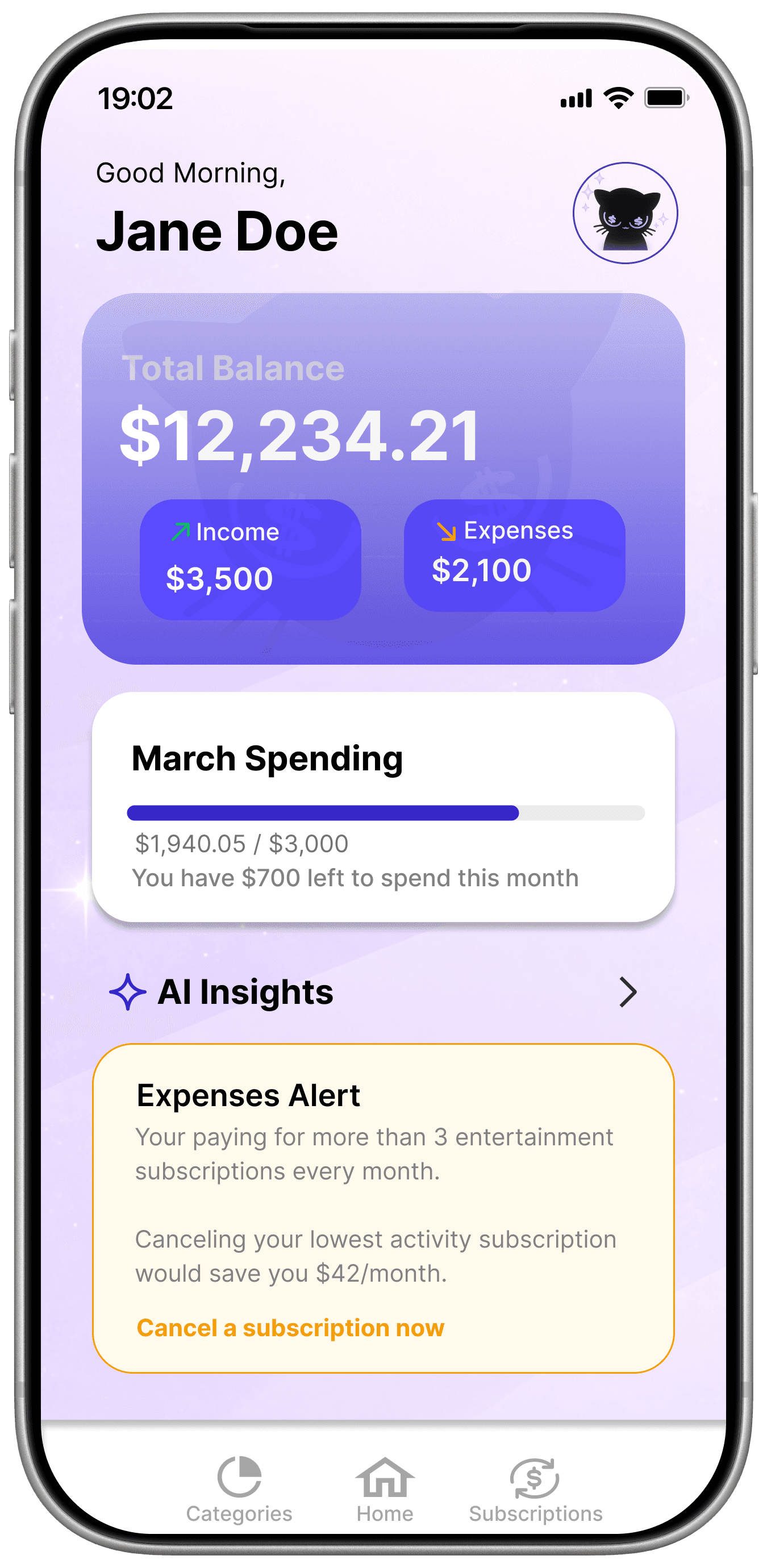
The final MakeCents experience brings financial awareness and action into one connected workflow. Automated subscription tracking, contextual AI insights, and clear spending visualizations help users understand where their money is going and identify opportunities to act.

Feature 02
Subscription Management
Recurring subscriptions are automatically organized into one view, giving users visibility into cost, activity, and upcoming renewals. Contextual status indicators help users quickly distinguish subscriptions they actively use from ones that may be worth reconsidering.
Feature 03
AI Insights
MakeCents turns spending patterns into personalized, actionable recommendations. Instead of asking users to interpret their financial data themselves, AI insights surface opportunities to save, flag unusual spending, and suggest relevant next steps.


Feature 04
Spending Overview
The spending overview organizes monthly expenses into clear categories and shows progress against users’ budgets. Rather than overwhelming users with transaction-level data, visual summaries make it easier to understand spending patterns and identify where adjustments may be needed.
Reflection
MakeCents taught me that designing for financial awareness isn't just about presenting better data—it's about helping users know what to do with it. The project pushed me to think more intentionally about timing, information hierarchy, and how AI can support decisions without adding complexity.
Designing for Behavior
Awareness alone doesn't change behavior. The experience needed to surface guidance at moments when users could actually act on it, turning financial information into clearer decisions.
Balancing Simplicity and Functionality
Financial products can quickly become overwhelming. Prioritizing essential information and progressively revealing detail helped us maintain useful functionality without increasing cognitive load.
Designing for Trust
Working with financial data made transparency especially important. From account connection to AI recommendations, interactions needed to clearly communicate what was happening and why.
Looking Ahead