

Overview
Gmail Job Tracker is a concept that brings application tracking directly into the inbox, helping job seekers organize opportunities without adding another tool to their workflow.
Our team designed a dedicated workspace within Gmail where users can track application status, revisit job details, and manage follow-ups—all alongside the emails already driving their job search.
Role
Product Designer
Timeline
5 Weeks
Team
4 people
My Contributions
User Research · Prototyping · Product Design
The Problem
Job seekers manage dozens of application-related emails alongside everything else already competing for attention in their inbox. Important updates, interview details, and follow-ups can easily get buried, forcing users to rely on spreadsheets, separate accounts, or manual organization systems just to keep track of their search.
Research & Key Findings
We conducted 4 semi-structured interviews with participants who were currently or recently applying for jobs. We asked them to walk through their entire application process end-to-end: what they applied to, how they tracked it, what happened when emails came in, and what broke down.
Insight 01
Email alone wasn’t enough
All participants relied on Gmail for updates, but it mixed with everything else in their inbox. Two built Excel spreadsheets to track progress and both eventually abandoned them.
Insight 02
Inbox overload caused real stress
Participants described starring emails, leaving things unread, and checking their inbox multiple times a day. One noticed a time-sensitive email late because it had gotten buried.
Insight 03
Manual tracking created extra work
Participants wanted application emails to be organized automatically rather than maintaining a separate tracking system themselves.
"I made a new email just for my professional stuff. I had a spreadsheet with date, status, and job… and updated it frequently until I kept getting rejected."
Interview participant, actively job searching
"I want everything in one spot so I won't have to use multiple apps and websites like I am now."
Interview participant, recent graduate
User Flows
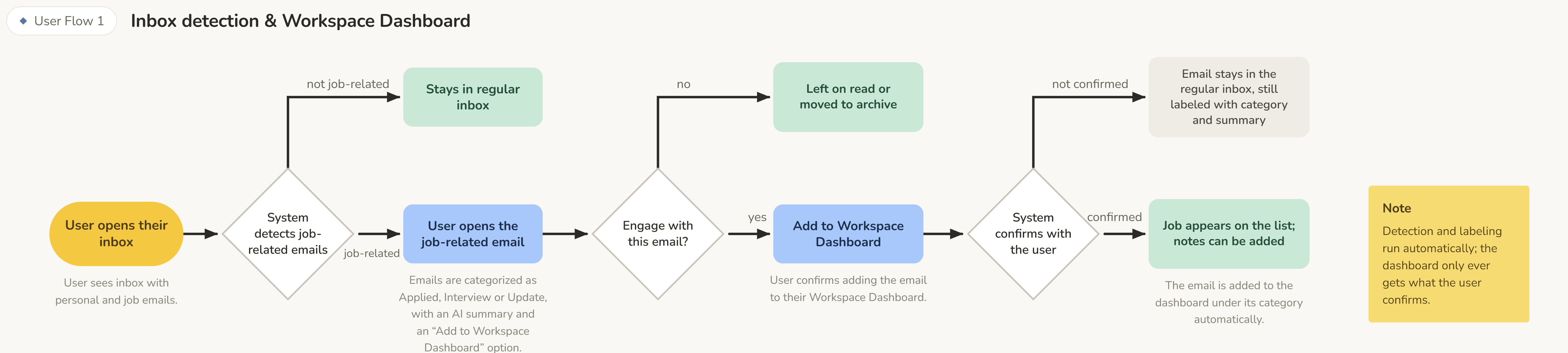
Mapping how application emails move from the inbox into the Job Tracker.
←
→
Design Decisions
We started with low-fidelity sketches to explore the information architecture before touching Figma, moving through 7 milestones of iteration. Three key design decisions shaped the final product.
Decision 01
Make application tracking scalable
Our initial prototype displayed all four application statuses in a Kanban board. While it worked with a small number of applications, the layout became difficult to scan as more entries accumulated. Testing reinforced the issue, so we moved each status into its own tab—preserving quick status switching while giving applications more room to scale.

Decision 02
Keep job details accessible, not intrusive
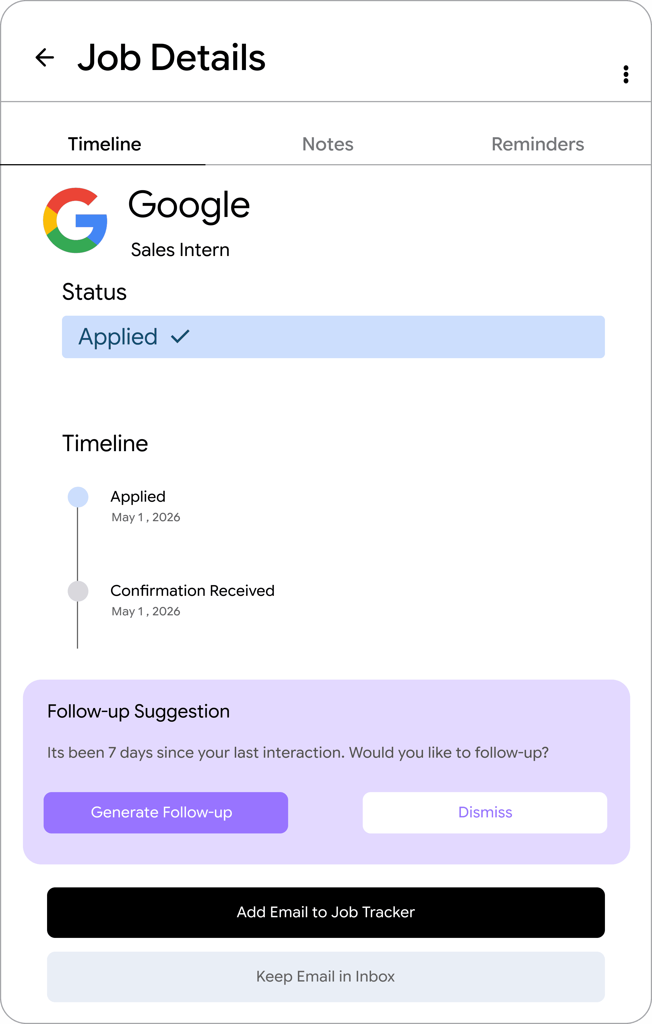
Selecting an application opened a side panel with its email timeline, notes, follow-up suggestions, and reminders. Testing showed that while this context was useful, keeping the panel open could make the workspace feel crowded. We made it collapsible so users could access deeper information when needed without sacrificing space during everyday tracking.
Decision 03
Design for where job searching happens
Our initial concept focused on desktop, but interviews showed that participants frequently checked job-related emails from their phones throughout the day. That meant application tracking couldn’t depend on users returning to a desktop. We adapted the experience for mobile, preserving the same status-based organization while making applications easy to check and manage on the go.

Final Solution
The final experience brings application tracking into the tool users already rely on, connecting job-related emails, application progress, and follow-ups within Gmail.
Feature 01
See every application at a glance
Job-related emails automatically organize into status-based views: Applied, Interview, Offer, and Rejected. Instead of maintaining a separate spreadsheet or tracker, users can see where every opportunity stands directly within Gmail.


Feature 02
Keep every interaction in context
Each application brings related emails, status updates, notes, and reminders into one chronological view. When an application goes quiet, Gmail can suggest a follow-up while letting users decide whether to send it and when.
Feature 03
Track applications anywhere
We extended the Job Tracker to mobile after research showed participants frequently checked job-related emails from their phones. The mobile experience preserves the same status-based organization and application details in a format designed for quick, on-the-go check-ins.

Reflection
This project taught me that reducing friction isn't always about adding functionality. The greatest improvements came from understanding how job seekers already used Gmail, then designing around those existing behaviors rather than asking them to adopt another system.
Design around existing behavior
Participants already relied heavily on Gmail throughout their job search. Integrating tracking into that existing workflow helped us reduce the need for separate spreadsheets and tools while keeping application progress visible.
Automation still needs user control
Features like automatic email detection and follow-up suggestions could reduce repetitive work, but testing showed that users still wanted control over what entered their tracker and when actions were taken.
If I continued this project
I would improve email categorization to better handle recruiter messages, third-party applicant tracking systems, and calendar invitations. I would also explore ways to acknowledge rejection without reinforcing discouragement, recognizing that a job-search tool should support the emotional experience of searching as well as the organizational one.
Mapping how application emails move from the inbox into the Job Tracker.