

Overview
Val’s Vegan Kitchen is a mobile ordering experience designed for a real restaurant client, serving both customers placing orders and staff managing daily operations.
As one of the project's primary designers, I led research and co-designed the full product alongside one teammate. I wrote our interview guide, conducted sessions with customers and restaurant staff, and presented iterations directly to our professor — who was also the restaurant's actual owner. Balancing customer needs with the day-to-day realities of running the restaurant shaped nearly every decision we made.
Role
UX Designer
Timeline
2 Weeks
Team
4 people
My Contributions
UX Research · Synthesis · Product Design
The Problem
Restaurant ordering apps have to serve two very different users. Customers expect ordering to be fast and effortless, while restaurant staff need control over menus, availability, and daily operations.
For customers, one of the clearest pain points was reordering. Repeating a previous meal required navigating through multiple screens for a task users expected to complete almost instantly.
Staff faced a different kind of friction. Everyday tasks like updating availability or pausing orders required navigating multiple screens, while unclear system feedback made it difficult to know whether changes had been saved.
3-4 —> 1
Taps to reorder a previous meal
Home → Account → Order History → Previous Order became a single reordering action.
Research & Key Findings
I led interviews with customers and restaurant staff to understand where everyday ordering and operational tasks created friction.
Insight 01
Reordering was too slow
Returning customers looked for a faster way to repeat previous meals, but reordering was buried several screens deep.
Insight 02
Important menu details were difficult to find
Customers with dietary restrictions expected allergen and dietary information earlier in the ordering process.
Insight 03
Staff needed clearer system feedback
Staff were unsure whether availability changes had saved, causing repeated actions and hesitation.
How might we design a restaurant experience that supports both customers and restaurant staff without increasing complexity for either group?
How Might We
Design Decisions
Decision 01
Make reordering immediate
Returning customers expected reordering to be quick, but the original flow buried previous orders several screens deep. We explored two approaches and chose to surface an Order Again card directly on the home screen, reducing the flow from 3–4 taps to one.

Decision 02
Design around staff workflows
Interviews with restaurant staff showed that speed mattered most during service. Instead of adapting the customer interface for staff use, we created a dedicated dashboard that surfaced high-frequency tasks like updating availability, adjusting preparation times, and pausing orders in one place.

Decision 03
Make system status unmistakable
Staff needed confidence that operational changes had actually taken effect. We added persistent availability states and immediate visual feedback so actions like marking an item out of stock were clearly reflected in the interface without requiring staff to double-check their work.

Final Solution
The final product connects two sides of the restaurant experience: a streamlined ordering flow for customers and an operational workspace built around restaurant staff's needs.
A faster path from craving to checkout

Discovery
Find what you want faster
Reorders, popular categories, and recommendations surface high-intent actions directly from the home screen.
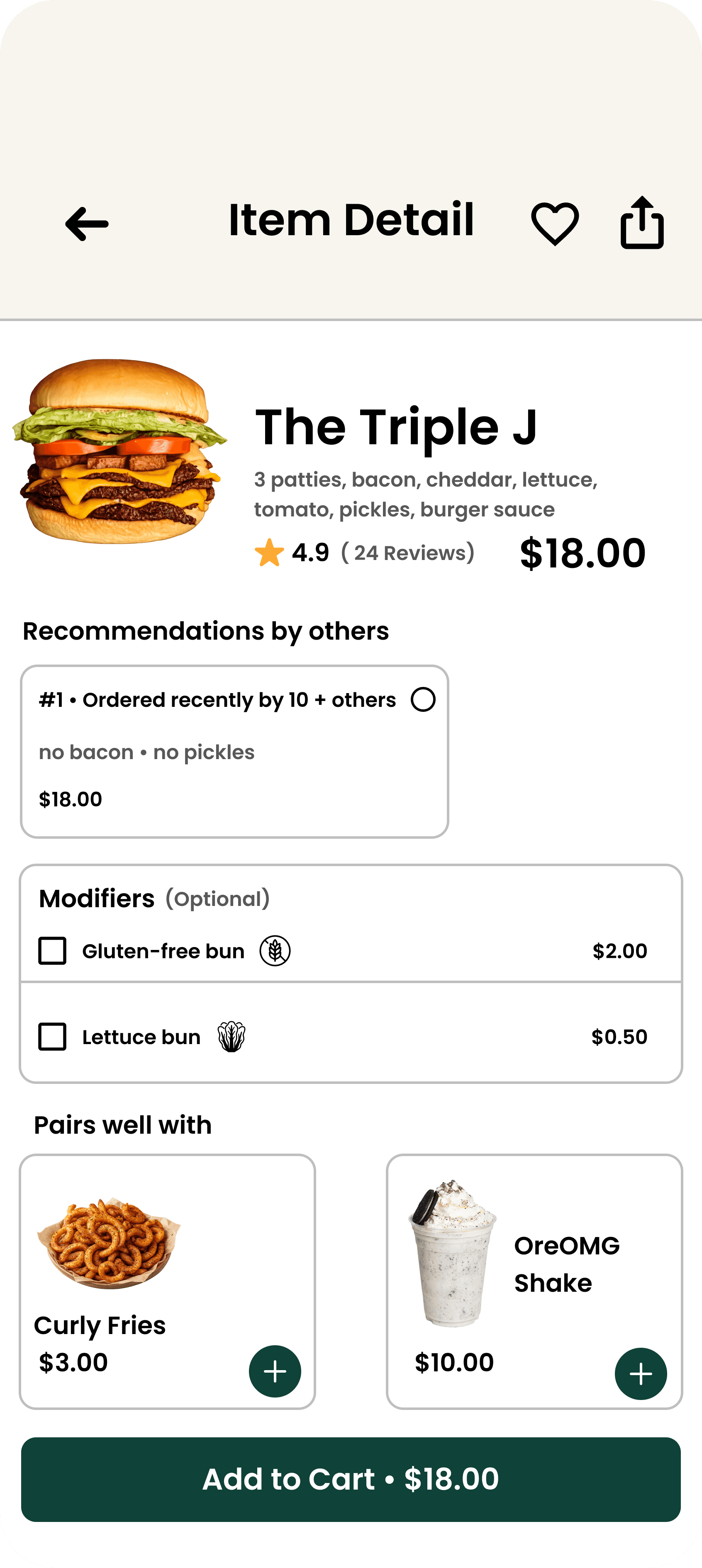
Customization
Make informed choices
Ingredients, dietary information, modifiers, and suggested pairings give customers the context they need before adding an item.

Checkout
Review before committing
A consolidated cart makes quantities, costs, and order details easy to verify before checkout.
More than just ordering
The experience extends beyond checkout with features that keep customers connected before, during, and after every order.

Menu Browsing

Promotions

Loyalty Program

Community

Order Status

About Us
Operational control in one place

Management Dashboard
Manage the day at a glance
Restaurant staff can edit menu items, pricing, modifiers, and availability from a centralized interface designed around their daily workflow.

Menu Administration
Respond in real time
Preparation times, out-of-stock items, and order availability can be updated immediately, helping staff adapt to changing restaurant conditions throughout the day.

Operations
Operate with confidence
Clear confirmation states and organized operational tools provide immediate feedback after every action, reducing uncertainty during busy service periods.
Tools for day-to-day management
Beyond the core workflows, staff can edit individual items, organize the menu, and review availability issues without leaving the management experience.

Item Detail Editor

Menu Layout Editor

Availability Report
Reflection
Working with a real client taught me that designing a product isn’t just about creating a polished interface. I had to understand two very different user groups, translate research into product decisions, and balance customer needs with the realities of running a restaurant.
Design the workflow, not just the screen
Testing showed me that small interaction costs compound quickly. Reducing reorders from 3–4 steps to one reinforced the importance of designing around the task a user is trying to complete, rather than individual screens.
Different users need different experiences
Customers prioritized speed and simplicity, while staff needed visibility and control. Separating their experiences allowed us to optimize each around its users instead of forcing both groups into the same interface.
Constraints sharpen decisions
Working with an actual restaurant pushed me to evaluate ideas beyond whether they looked good. Each decision had to make sense for the customer while remaining practical for staff to use during everyday operations.